This building is located on Pittsburgh's North Shore, and also just so happens to be the building I stood in front of when I snapped a certain panorama of the city.
 Okay, lets just be real here. This is an amazing building in terms of design. Notice the use of one thing - the line. Some lines are straight, like those going vertical. But the ones moving horizontal...have some movement to them. Your eye starts at one end and stops at the other...EVERY TIME YOU LOOK AT IT.
At night, the outside rooms are lit to let the light shine through the beautiful floor-to-ceiling glass windows. This further accentuated the geometrical shape of the building. Though this picture does not cover the short face, the framing does not just follow a square on square pattern. There is a little chaos added to the look, almost giving it the appearance of interlaced bricks.
Floppy Table
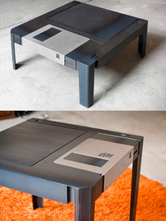
This table is actually not "floppy" at all. But it looks like one. This simple and elegant design is a nerd's man-cave must. The detail is subtle but strong. No features are found that don't need to be there. Even the legs are built-in in a way that seems as if it always had those little guys tucked into the plastic sheathing.
Though I have not seen it in person, I wonder if that protector bracket actually slides back and forth to reveal a small storage space...

I haven't covered a not-so-good design yet, and when this one caught my eye, I decided to make it happen.
Apart from the sticker on the whole being a bit small, and the mediocre choice in numeral font, it was difficult to figure out what this bumper sticker was advertising for.
...I'm actually still a little confused.
Simplicity is great, but too much can be harmful, and I think this is an example of that.
Off the top of the noggin, 4 simple things could improve this ad 150%.
1. Bigger and in the proper location on the car.
2. Add a splash of color. It's a painting company, it should be bright and catchy.
3. Properly size the elements on the larger canvas.
4. Add a catch phrase that sticks.
Harmonious Chocolate
This ad, composed by designer/photographer/writer Christopher Griffith combines three things seamlessly at once. Simplicity, Presentation and ICE CREAM. There are several pieces that make this ad so good. Lighting. The splash of the chocolate would look like poop (literally) without the light to give it all the lustful reflections which make it so desirable. Moreover, the plate on the right with the scoop on top. Again, broad and pleasing lighting to give it depth and desire. Like i said, simplicity plays a part here. Five words. Perfectly strung together to make you laugh and hunger at the same time. Color pallet- black, white, chocolate, plate. No more no less. There is nothing here that does not need to be. Interesting to note that my eye ends at the Haagen Dazs logo. I take in the ad, I am blown away, then I see the company. Boom. Perfect placement. This is probably my favorite ad so far.

Oh by the way, Christopher Griffith also designed the Dart Ad featured on the first page of my campaign essay.
No comments:
Post a Comment