Wednesday, February 27, 2013

Papyrus...ew, Music, Barcelona and ...A Couch?


Middle C Music Store
While I was in Washington DC last weekend, we drove by this cute little music store with, what might be one of the most clever logos I've ever seen (for a music store). Though I wasn't able to snap a photo from my street view I was able to find their logo online. It was centered in every window pane that bordered the sidewalk. So let's just point out the elephant in the room- how the C is used to create the musical note. Though it may not be the most aesthetically pleasing design in the world, it was still unexpected, which made it memorable. I didn't have to write down the name of the store...I just remembered it because of the logo. It's simple & it's concrete. Everyone knows what "middle C" is. This logo, in a way, brings it to life.


 Major City Buildings

I was surfing around online and found these bad boys the other day and I thought they were incredible. I say "these" because there are several; one for New York, Tokyo, London, Sydney and a few more. What I really liked was the simplicity of the layout and the layer blending mode/s that allowed you to see the entirety of a building, even if it was behind other objects. (Although after playing with my own, it may be as simple as 60% opacity on all the layers with no blending mode involved) But the overlaps create extra contrast and really make the items pop off the page. There is consistency among the nine city designs, in that they all follow a similar color scheme, all stay within certain measurements on the page, and even the kerning of the city names changes to fill the space at the top of the page. Notice the little ruler on the right that gives you the approximate height. Clever and well-made designs.
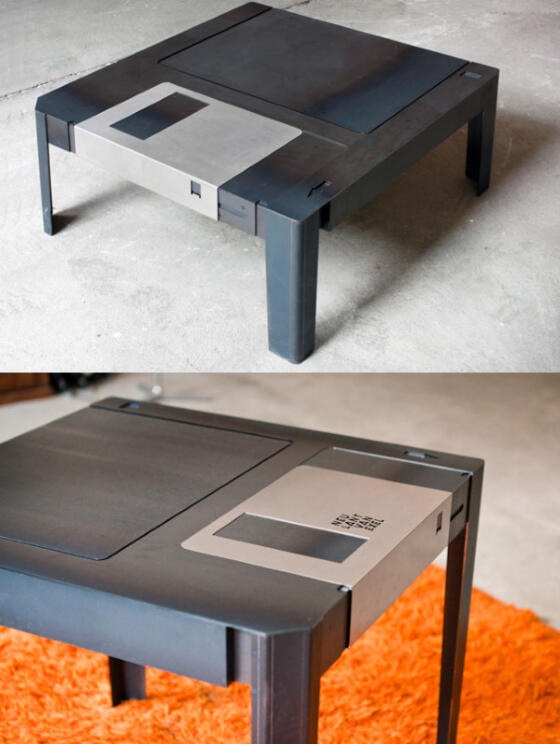


The Floorscape.
Oh. My. Goodness. When I saw this thing, I instantly wanted it. Though I must admit, I can't speak for it's comfort and/or function, it is SUCH a neat design! One color, black. One shape, the triangle. Functions? Many. Frame and body are one, and there really isn't detail there that doesn't need to be. It's Simple. Let me play the sales-person and assume it's as comfortable as a couch. What would I try to sell about this piece of furniture? Obviously function. Which is why it was designed in the first place. The two, I feel, go hand in hand. The form speaks of the function and reaches out to the type of person who seeks both for a "modern" "chic" home.
Will I remember this because of it's design? Yes.
Would I buy one of it's comfortable? Yes!


Business Card of the YEAR.
I'm a nerd in love. I found this business card online and I gotta say...it may just be the best card design...I've ever seen. The design is SO simple. Squares. Circle. Even a triangle. (but you don't realize it at first) A few fantastic shades of orange with a couple shades of grey. And the BEST part- the front and back of the cards creates the complete design. Thats what did it for me. It's one of those little hidden tricks that until someone SEES them side by side, they may not even know.
But YOU know.
In my own humble opinion, the circle could be brought to the right a bit to bring it back onto the card completely, but maybe that was tried and seems too expected.
Oh...but one other thing I JUST noticed...I think the contact font is Papyrus.

But you won't find that on MY next business card design!


Wednesday, February 13, 2013

Purple Elephants, Ugly Tables and Three Hotels in the Desert


Cadillac Ciel Concept
Let's just go ahead and talk about the purple elephant in the room, shall we? I'm talking about none other than the Cadillac Ciel Concept model. Its's quite possibly in the top 5 of my favorite cars of all time, and I just discovered it last week! Although personal taste may drive some away from this vehicle, it is undeniably a beautiful and well-designed car. Why? It brings together two different styles of car design and somehow makes them work. Those two styles being curves vs edges. Typically, a car will either be dominated by edges and have a very "sharp" look to it, or it will be "soft", with pleasant curves. This concept has both. Look at the side shot. The beam of the car is barely defined because it's one big soft curve. But the front end looks like Michael Bay designed it to replace his collusion truck! Here's another thing. Most cars are "segmented", in that the body is its own area, connected to but sperate from the bonnet and boot. But notice on this car...it all looks like it's one unit! The interior gets me every time I look at it. The "switch" between exterior and interior is so seamless, I have a hard time even distinguishing where it is. Again, creating one singular uni. Notice the use of the line as a tool to separate the different materials and sections. It is incredibly simple. No detail or widget is there that does not need to be.


Flower Vase
I noticed this flower vase while at work the other day, and it caught my eye in several ways (literally). From the close up pictures, it's a looped glass vase, shaped by 'offly proportionate' circles that are further offset as you proceed vertically. What you get is a horizontal set of lines that separate the loops, but also a vertical set of lines that shift and sway to the shape of the vase. No matter what way the light hits it, there are always 4 or 5 lines running top to bottom, and they are always moving. The vase is inanimate, but has characteristics of being alive and flowing. It's simple, elegant, and in a way, you could say it resembles the shape of a woman.


Jumeirah Beach Hotel
Forgetting the Burj Al Arab and the Burj Khalifa hotels for just a moment, this one has to be one of the greatest hotels I've ever seen! It is located in Dubai, Saudi Arabia... and has it's own harbor... need I say more? Okay, I will! It completely defies what a hotel is supposed to look like. Square? No. Straight? No. What is it in the shape of? A FREAKING OCEAN WAVE. Google it and look at it straight from the side. Its a wave. SO CLEVER. I added the third picture to exploit the curve to the building, which adds an incredible dynamic of movement and flow. Notice how it is shaped thin, so that there are more rooms with an outside view. The curves on the ends are exact oposites and negatively mirror each other. The glass outer shell gives it a mirror-like refection.


That Poor Table...
Celebrated architect, Zaha Hadid has designed quite a few things, ranging from buildings to now, apparently tables. The only problem is... it's not very nice.
It's bright, it's shiny, it's primary red....and it's friggin' tilted.
I picture this table being housed in an apartment with gleaming white walls covered in Keith Hearing prints. It's simple. It's unexpected. But it misses the core...being a working table.


Wednesday, February 6, 2013

Architecture! One Harmonious Treat! A Little Nerdiness and...What...? Feb 6

Alcoa Corporate Center
This building is located on Pittsburgh's North Shore, and also just so happens to be the building I stood in front of when I snapped a certain panorama of the city.
Okay, lets just be real here. This is an amazing building in terms of design. Notice the use of one thing - the line. Some lines are straight, like those going vertical. But the ones moving horizontal...have some movement to them. Your eye starts at one end and stops at the other...EVERY TIME YOU LOOK AT IT.
At night, the outside rooms are lit to let the light shine through the beautiful floor-to-ceiling glass  windows. This further accentuated the geometrical shape of the building. Though this picture does not cover the short face, the framing does not just follow a square on square pattern. There is a little chaos added to the look, almost giving it the appearance of interlaced bricks.


Floppy Table

This table is actually not "floppy" at all. But it looks like one. This simple and elegant design is a nerd's man-cave must. The detail is subtle but strong. No features are found that don't need to be there. Even the legs are built-in in a way that seems as if it always had those little guys tucked into the plastic sheathing.
Though I have not seen it in person, I wonder if that protector bracket actually slides back and forth to reveal a small storage space...


Missing the point...
I just want to go on record here, to say that chasing this car down on Morehall Road, holding my phone, praying for a mutual red light was no easy task.
I haven't covered a not-so-good design yet, and when this one caught my eye, I decided to make it happen.
Apart from the sticker on the whole being a bit small, and the mediocre choice in numeral font, it was difficult to figure out what this bumper sticker was advertising for.
...I'm actually still a little confused.
Simplicity is great, but too much can be harmful, and I think this is an example of that.
Off the top of the noggin, 4 simple things could improve this ad 150%.
1. Bigger and in the proper location on the car.
2. Add a splash of color. It's a painting company, it should be bright and catchy.
3. Properly size the elements on the larger canvas.
4. Add a catch phrase that sticks.


Harmonious Chocolate
This ad, composed by designer/photographer/writer Christopher Griffith combines three things seamlessly at once. Simplicity, Presentation and ICE CREAM. There are several pieces that make this ad so good. Lighting. The splash of the chocolate would look like poop (literally) without the light to give it all the lustful reflections which make it so desirable. Moreover, the plate on the right with the scoop on top. Again, broad and pleasing lighting to give it depth and desire. Like i said, simplicity plays a part here. Five words. Perfectly strung together to make you laugh and hunger at the same time. Color pallet- black, white, chocolate, plate. No more no less. There is nothing here that does not need to be. Interesting to note that my eye ends at the Haagen Dazs logo. I take in the ad, I am blown away, then I see the company. Boom. Perfect placement. This is probably my favorite ad so far.

Oh by the way, Christopher Griffith also designed the Dart Ad featured on the first page of my campaign essay.