Thursday, April 4, 2013

Mindwarping Graphic Art, A thing with Circles...and the beast that killed Steve Irwin?!?!


MindWarp Business Card
I came across these business cards on a design site this week, and I have to say, I like them quite a bit.
The biggest thing to like about this design is its simplicity; there is minimal content on the card, only three colors to be found and there is very good use of negative (or in this case, blank) space. One of the other pieces I find intriguing is the logo. The M and W are very cleverly fit together into one flowing unit- yet, they are broken apart a bit as well. The one solid line between the uprights almost looks like a bolt of lightning (or something that might warp your mind a bit?)
Truth be told, this company deals with video & audio production and web design services. Their website follows the look of their business card and is instantly captivating with their demo reel.
The logo design, use of color and simplicity of the content is what makes this a good design.


L'INFINITO Graphic Art


This piece is by a graphic artist named Victor Vercesi, and while much of his content isn't necessarily "design" this one caught my eye for a few specific reasons. Those reasons are some of the rules of CRAP, as well as some of the elements of sticky ideas. First up, Contrast. The photo itself is vibrant and contrasty, but there is also contrast in that there are portions of the image shifted around, thus causing some of that sky blue to be where the orange concrete is. And visa-versa. Which takes you to a sticky element- Unexpected. This image really takes you by surprise. It's almost in a surrealistic way, but not quite. It's got that X factor. You don't know what it is, but you're drawn to it. Look at the way the lines draw you to the center- even in the switched areas, the lines still follow that path the middle. There is alignment and movement to it. So its got contrast, its got alignment, and it's unexpected. The only problem is that it's completely abstract. Hey...ya can't win 'em all.


The One and Only - Chevrolet Corvette Stingray!

This. Car. Rocks. Where does one even begin with this car? As if the Corvette hasn't been an A-list model before, this new Stingray model for 2014 completely changes the game. Chevrolet's catch phrase on their website reads "enemy of the same" and I think this is true for the new Stingray. From a strictly exterior design standpoint, it is easy to see that the car has had a complete redesign. And I think this is their best yet. Corvette has always been low sleek and wide with that markable dip in the middle of the body. But in years past, it's featured boring rounded edges and a "stuck in the 90's" body. This has all changed now. Corvette uses the line and a hard edge to accentuate its curves (which are still there, but now more subtle). I noticed a heavy use of a "part triangle" or in some cases, a right angle. The air intake, the rear lights, the rear bumper, the front end, the outline of the cab. The headlights and specifically the tail lights are a feature to point out. The entire flow of the car, follows the look of a stingray in such a "flesh-to-metal" way.
Here's one other thing I noticed. Right behind the front wheel well, at the air intake, where the famous dip in the body is- there are two lines that meet and exchange in, I think, an absolutely genius way. Remember those subtle curves? One of them is the outline of the front quarter pannel, which dips down to meet the windshield and flow to the rear end. But something happens right behind that air intake. The beam of the body is born and makes its way up the door to the rear. At that exchange of those three lines (the third being the intake accent edge) the picture that comes to mind is human muscles that converge and overlap each other. Now does that SAY American Muscle? I'll let you decide.
I'm not sure if new designers were brought in for this project, but Corvette has had some serious European influence. It's looking VERY Ferrari 599ish. And thats a GOOD thing. I think that Corvette has long been a contender for Super Car status; it's got the horsepower to play with the big boys and a top speed that beats out most Porches...but for whatever reason, it's just never gotten there. Maybe it's because they're American born... Maybe it's because they run for under $100k... Whatever the reason, perhaps these new European-influenced design changes will finally get the Corvette accepted into the Super Car club.


Bau Pendant Decoration
This decoration is eye-catching to say the very least. Allow me to quote the site from whence I found it. This is quite interesting. 
"The Bau Pendant is a sculptural, bold hanging lamp with attitude. The eye-catching light designed byVibeke Fonnesberg Schmidt is representative of her fascination with geometric forms. Conceived with precise attention to construction and composition, this piece for Normann Copenhagenpractically commands attention with its Mondrian-inspired primary color palette and unconventional structure."
Unconventional structure...with CIRCLES? Apparently, YES. And it's true. But you know what else you find on this guy? Lines. Every circle that appears sideways...appears as a line to us. Sometimes making squares. Mind = Blown. The use of primary colors, along with the natural wood color keeps this design simple, though it is quite complex.
Simply Complex. Thats all I have to say.




Thursday, March 14, 2013

Hospitals for The Empire and a Light that Doesn't End??


Helen DeVos Children's Hospital


While I was visiting Grand Rapids, I noticed an incredible building downtown. It's the city's brand new Helen DeVos Children's Hospital; and it is a very pretty building. All of the exterior glass is tinted in shades of dark blue. They are not all the same shade, which makes it look like a stained glass window, but since all the shades of blue are in the same close family, it looks very classy. The building itself is in the shape of an oval. And the reason for this type of shape and the blue color is a cultural thing that Grand Rapids is doing with their new architecture, mimicking nature and the flow of water, as the city is based on a river. 
Several new buildings, like their convention center and airport have followed this style of smooth, flowy architecture in their new construction. The best part about this building, however, is the sky-bridge connecting it to an older portion of the hospital and multi-business building across the street. It was very cool to go by this hospital and pass under the sky-bridge. Interestingly, the bridge flows from a smooth funnel-type look at the new end, to a hard-edged square and triangle type look on the other side of the street. It makes for a very dynamic design!


Actions

I found this little design on Instagram the other day. Yeah, hold your snarky remarks till the end, okay... But I tracked down the name of the author and a close-to-the-original-post. This little graphic was created by designer, John Tibbott and it is a design that SPEAKS. 
We all know the phrase, "Actions speak louder than words". Well this design takes that somewhat abstract phrase and turns it into a concrete visual. Notice that the speech bubble comes FROM the "words" as if to say, your words can talk all they want, but the actions, even of your words, will speak so much louder. This design is incredibly simplistic and very very clever. That tiny little shadow underneath really gives the elements a sense of space and 3D, which is a nice touch for a 2-dimensional design. The use of simple textures and light color brings the focus to the message and not the design itself. 


Infinity Light

Let me just start this by saying I WANT THIS LIGHT. This hanging lamp/light was designed by New York artist/designer, Taras Kravtchouk, the same gentleman who designed those "Tarform Refined Knives".
The impossible triangle, the infinity knot, both of these being cool design concepts for prints web, but never really feasible as physical objects...right? False. This lamp takes the infinity knot and turns it into a physical object; quite beautifully, I might add. The thing that captures me the most is the simple use of the line as a a shaping tool and as an edge at the same time. There are a few other photos on Taras' website, one of which is from a 90 degree angle. It's SO BRILLIANT. Simple, simple circle and lines being used in beautiful togetherness to create this modern, contemporary lamp.
I want practically EVERYTHING this guy has designed. He is a truly inspired designer who has "Simple" down to a science.


Star Wars Faux Ad
One of the keys to good design is simplicity. This little number takes simple to a whole new level! The Death Star and Star Destroyers have become iconic designs in the years following the Star Wars saga. This artist, named Szoki, took those iconic designs and boiled them down to their most basic level. There is little detail here that does not need to be, yet the shapes are still a givaway to what the objects are. Furthermore, there is INCREDIBLE contrast among the use of colors. It's almost like a spin off of negatives. The line down the middle, separating the colors, I think does another thing- adds a 3-dimensional look to the star destroyer. A very clever way to make such a simple design appear to be in 3 dimensions. I love the font choice and the alignment to that center line. Use of the rules of CRAP at work.


Wednesday, February 27, 2013

Papyrus...ew, Music, Barcelona and ...A Couch?


Middle C Music Store
While I was in Washington DC last weekend, we drove by this cute little music store with, what might be one of the most clever logos I've ever seen (for a music store). Though I wasn't able to snap a photo from my street view I was able to find their logo online. It was centered in every window pane that bordered the sidewalk. So let's just point out the elephant in the room- how the C is used to create the musical note. Though it may not be the most aesthetically pleasing design in the world, it was still unexpected, which made it memorable. I didn't have to write down the name of the store...I just remembered it because of the logo. It's simple & it's concrete. Everyone knows what "middle C" is. This logo, in a way, brings it to life.


 Major City Buildings

I was surfing around online and found these bad boys the other day and I thought they were incredible. I say "these" because there are several; one for New York, Tokyo, London, Sydney and a few more. What I really liked was the simplicity of the layout and the layer blending mode/s that allowed you to see the entirety of a building, even if it was behind other objects. (Although after playing with my own, it may be as simple as 60% opacity on all the layers with no blending mode involved) But the overlaps create extra contrast and really make the items pop off the page. There is consistency among the nine city designs, in that they all follow a similar color scheme, all stay within certain measurements on the page, and even the kerning of the city names changes to fill the space at the top of the page. Notice the little ruler on the right that gives you the approximate height. Clever and well-made designs.


The Floorscape.
Oh. My. Goodness. When I saw this thing, I instantly wanted it. Though I must admit, I can't speak for it's comfort and/or function, it is SUCH a neat design! One color, black. One shape, the triangle. Functions? Many. Frame and body are one, and there really isn't detail there that doesn't need to be. It's Simple. Let me play the sales-person and assume it's as comfortable as a couch. What would I try to sell about this piece of furniture? Obviously function. Which is why it was designed in the first place. The two, I feel, go hand in hand. The form speaks of the function and reaches out to the type of person who seeks both for a "modern" "chic" home.
Will I remember this because of it's design? Yes.
Would I buy one of it's comfortable? Yes!


Business Card of the YEAR.
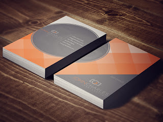
I'm a nerd in love. I found this business card online and I gotta say...it may just be the best card design...I've ever seen. The design is SO simple. Squares. Circle. Even a triangle. (but you don't realize it at first) A few fantastic shades of orange with a couple shades of grey. And the BEST part- the front and back of the cards creates the complete design. Thats what did it for me. It's one of those little hidden tricks that until someone SEES them side by side, they may not even know.
But YOU know.
In my own humble opinion, the circle could be brought to the right a bit to bring it back onto the card completely, but maybe that was tried and seems too expected.
Oh...but one other thing I JUST noticed...I think the contact font is Papyrus.

But you won't find that on MY next business card design!


Wednesday, February 13, 2013

Purple Elephants, Ugly Tables and Three Hotels in the Desert


Cadillac Ciel Concept
Let's just go ahead and talk about the purple elephant in the room, shall we? I'm talking about none other than the Cadillac Ciel Concept model. Its's quite possibly in the top 5 of my favorite cars of all time, and I just discovered it last week! Although personal taste may drive some away from this vehicle, it is undeniably a beautiful and well-designed car. Why? It brings together two different styles of car design and somehow makes them work. Those two styles being curves vs edges. Typically, a car will either be dominated by edges and have a very "sharp" look to it, or it will be "soft", with pleasant curves. This concept has both. Look at the side shot. The beam of the car is barely defined because it's one big soft curve. But the front end looks like Michael Bay designed it to replace his collusion truck! Here's another thing. Most cars are "segmented", in that the body is its own area, connected to but sperate from the bonnet and boot. But notice on this car...it all looks like it's one unit! The interior gets me every time I look at it. The "switch" between exterior and interior is so seamless, I have a hard time even distinguishing where it is. Again, creating one singular uni. Notice the use of the line as a tool to separate the different materials and sections. It is incredibly simple. No detail or widget is there that does not need to be.


Flower Vase
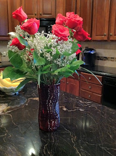
I noticed this flower vase while at work the other day, and it caught my eye in several ways (literally). From the close up pictures, it's a looped glass vase, shaped by 'offly proportionate' circles that are further offset as you proceed vertically. What you get is a horizontal set of lines that separate the loops, but also a vertical set of lines that shift and sway to the shape of the vase. No matter what way the light hits it, there are always 4 or 5 lines running top to bottom, and they are always moving. The vase is inanimate, but has characteristics of being alive and flowing. It's simple, elegant, and in a way, you could say it resembles the shape of a woman.


Jumeirah Beach Hotel
Forgetting the Burj Al Arab and the Burj Khalifa hotels for just a moment, this one has to be one of the greatest hotels I've ever seen! It is located in Dubai, Saudi Arabia... and has it's own harbor... need I say more? Okay, I will! It completely defies what a hotel is supposed to look like. Square? No. Straight? No. What is it in the shape of? A FREAKING OCEAN WAVE. Google it and look at it straight from the side. Its a wave. SO CLEVER. I added the third picture to exploit the curve to the building, which adds an incredible dynamic of movement and flow. Notice how it is shaped thin, so that there are more rooms with an outside view. The curves on the ends are exact oposites and negatively mirror each other. The glass outer shell gives it a mirror-like refection.


That Poor Table...
Celebrated architect, Zaha Hadid has designed quite a few things, ranging from buildings to now, apparently tables. The only problem is... it's not very nice.
It's bright, it's shiny, it's primary red....and it's friggin' tilted.
I picture this table being housed in an apartment with gleaming white walls covered in Keith Hearing prints. It's simple. It's unexpected. But it misses the core...being a working table.


Wednesday, February 6, 2013

Architecture! One Harmonious Treat! A Little Nerdiness and...What...? Feb 6

Alcoa Corporate Center
This building is located on Pittsburgh's North Shore, and also just so happens to be the building I stood in front of when I snapped a certain panorama of the city.
Okay, lets just be real here. This is an amazing building in terms of design. Notice the use of one thing - the line. Some lines are straight, like those going vertical. But the ones moving horizontal...have some movement to them. Your eye starts at one end and stops at the other...EVERY TIME YOU LOOK AT IT.
At night, the outside rooms are lit to let the light shine through the beautiful floor-to-ceiling glass  windows. This further accentuated the geometrical shape of the building. Though this picture does not cover the short face, the framing does not just follow a square on square pattern. There is a little chaos added to the look, almost giving it the appearance of interlaced bricks.


Floppy Table

This table is actually not "floppy" at all. But it looks like one. This simple and elegant design is a nerd's man-cave must. The detail is subtle but strong. No features are found that don't need to be there. Even the legs are built-in in a way that seems as if it always had those little guys tucked into the plastic sheathing.
Though I have not seen it in person, I wonder if that protector bracket actually slides back and forth to reveal a small storage space...


Missing the point...
I just want to go on record here, to say that chasing this car down on Morehall Road, holding my phone, praying for a mutual red light was no easy task.
I haven't covered a not-so-good design yet, and when this one caught my eye, I decided to make it happen.
Apart from the sticker on the whole being a bit small, and the mediocre choice in numeral font, it was difficult to figure out what this bumper sticker was advertising for.
...I'm actually still a little confused.
Simplicity is great, but too much can be harmful, and I think this is an example of that.
Off the top of the noggin, 4 simple things could improve this ad 150%.
1. Bigger and in the proper location on the car.
2. Add a splash of color. It's a painting company, it should be bright and catchy.
3. Properly size the elements on the larger canvas.
4. Add a catch phrase that sticks.


Harmonious Chocolate
This ad, composed by designer/photographer/writer Christopher Griffith combines three things seamlessly at once. Simplicity, Presentation and ICE CREAM. There are several pieces that make this ad so good. Lighting. The splash of the chocolate would look like poop (literally) without the light to give it all the lustful reflections which make it so desirable. Moreover, the plate on the right with the scoop on top. Again, broad and pleasing lighting to give it depth and desire. Like i said, simplicity plays a part here. Five words. Perfectly strung together to make you laugh and hunger at the same time. Color pallet- black, white, chocolate, plate. No more no less. There is nothing here that does not need to be. Interesting to note that my eye ends at the Haagen Dazs logo. I take in the ad, I am blown away, then I see the company. Boom. Perfect placement. This is probably my favorite ad so far.

Oh by the way, Christopher Griffith also designed the Dart Ad featured on the first page of my campaign essay.


Wednesday, January 30, 2013

Products & Magazine Edition - JAN 30


Whilst hunting though grocery stores and skimming though checkout magazines, I found a surplus of designs I enjoyed and thought usable for this week's post. Here are my favorites.


TIDE Brand Logo
The funny thing is that I have ALWAYS enjoyed this logo. And I don't even know why!
I mean, first off, its a red and yellow target. And if that doesn't scream LOOK AT ME I'm not sure what else would! The picture I have shows their detergent and a bleach line as well, and though the labels are a bit different, they stick to the same general color scheme, making them different and distinguishable, but not at all different.
And can we look at the bottle for just a minute?? The shape from the handle, to the other end of the body...is another target! Mind=Blown. Just kidding. But that really is very clever of them.


Magazine Spread Layout
 I found this one magazine spread particularly interesting. And I'm not usually one to be drawn to articles about food, but gosh golly, this one caught my eye after the second page turn. That's right,  it was a six-page spread about soups from Eating Well magazine.
What I really liked about this spread was its length and consistency throughout. It was all laid out nicely on a wooden prep-surface, and I have to admit, I'm a sucker for good woodwork.
With veggies, breads and other elements of deliciousness spread evenly throughout the pages, there was a good sense of movement and flow to the article. You'll also notice the title of the article, "Power Soups", with a bowl of hearty soup filling the places of the "O's".
Not a reinvention of the wheel, but well-used in this setting. The cleverness came with the choice of white for the tables and fonts, matching the ivory-ish color of the plates on the first and second spreads. The other colors, orange, for the carrots and a deep green for a hearty, appealing touch. I really enjoyed the look of this article.
(I also noticed some nice contrast, giving me ideas to improve my own food ad)


Veggie Wash Brand
Growing up at home, my family was very health cautious. We ate organic foods and washed our produce before we ate it, and we used Veggie Wash brand cleaner to give our produce a little bath. So growing up with this brand, its another one that I really enjoy. Intrigued as a young lad, I would stand at the sink and just stare at the words "Veggie Wash" made entirely out of...you guessed it, vegetables!
With one of the messages of this company being a safe and human-friendly solution to use on something you'll want to put in your mouth later, the design of this logo helps to convey that well. There are no browns or colors showing lack of health where they are not needed, instead, they are bright, greens, reds, oranges and colors of life and ripeness. There's a plug about being featured in "Good Housekeeping Magazine" right on the front label. This brand is identifying with the type of people like my family; cautious, safe, healthy and environmentally friendly.


Ultimate LEGO Batman Collection Book

Okay, I just had to do this one because, well, its me. I was a Lego kid growing up, and now, in my adulthood I appreciate the incredible design of these toys so much more.
This picture came from the "Ultimate LEGO Batman Collection Book" (available at Wegman's :) and I snapped this two-page spread to notice the layout of the page, use of colors, shapes and so on. What stuck me thinking about this book is that it has to cater to kids...and adults alike, as both children and collectors may be interested in purchasing it. And the great thing is that it DOES work for both. The colors are bright, the fonts are big, and the layout pulls your eye from piece to piece, as you drool over its awesomeness (like I did), but it's fully mature in its big-and-bright-ness. There are descriptions and "data files" to help the kids run away with their imaginations and give the adult readers a rush of returning adventures to stimulate their senses.
Oh BY THE WAY. Did you notice the Batman on the bottom left and the Joker on the bottom right. Those are flipbook animations where Batman throws a bat tool at the Joker and knocks him off his feet. I found that clever, along with the rest of the book, which yes, I did thumb through completely at the store. Not ashamed.


Well that's all for this week. See you next time!

Sunday, January 27, 2013

Introduction

Greetings and salutations.
This blog served me once before during my college career, in a writing class where blogging was required.
Now again, I call upon this humble blog to fulfill my duties in my senior year.

This is my design reflections journal, where I will talk about designs I've noticed from day to day and how they have impacted me.

Enjoy.